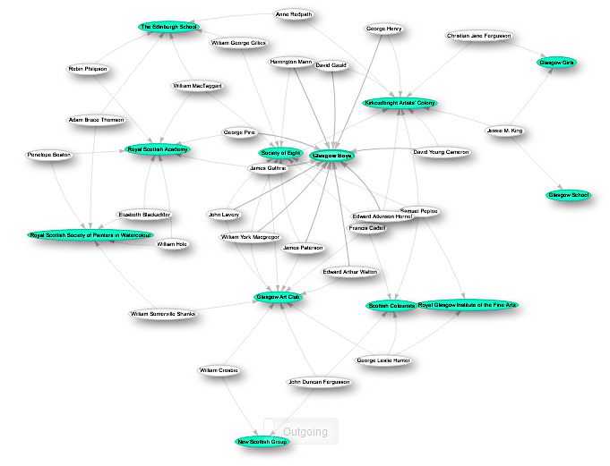
The changing groupings of artists over time are an example of networks in action. I think graphing these is a good example of the possibilities of using Wikidata to explore affinities.
This diagram provides a view of the associative network of artists to societies. It has been simplified to focus on those artists who were members of more than one society - without that filter, the diagram becomes unwieldy.
Obtaining this involved a 3 part process:
- A Python program to capture all the Scottish artist groups and collectives on Wikipedia, then extract the names of each artist mentioned in that article.
- The Wikidata items lacked cross-references to show which societies a particular artist was involved in, so I generating a file of P463 updates which could be fed into Quickstatements.
- The SPARQL query to extract details of the artists and societies and present this graph.
The query to generate the diagram can be run here.